Leafs & Grounds: Redesign
Overview
In Las Vegas, Leafs & Grounds specializes in caffeinated beverages and freshly made pastries. The interior highlights coziness by including various seats and couches while providing exceptional service that is personal to the locals that visit.
Challenge
The current site highlights a few snippets of what the inside of the coffee shop looks like, open hours, the location, and a menu. Something that I noticed right away was the different font usage and images that were sized differently so it made the overall site feel inconsistent. The overall challenge here was to make the site feel more consistent, visually appealing, and user-friendly.
My role in the redesign of this site was to perform research on what elements needed to be updated and make changes accordingly.
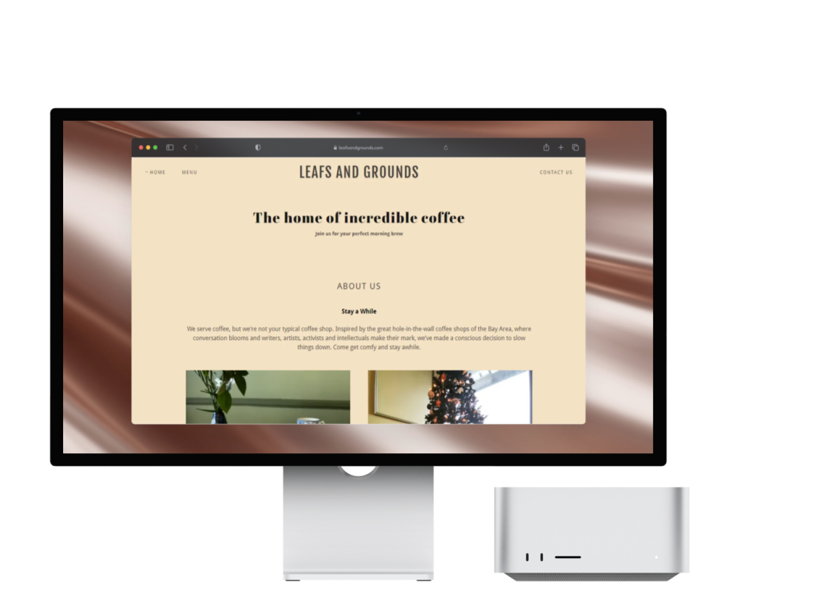
Image of the landing page
User Research
Overall Impression
“The site feels dull, I feel that it should capture the warmth of a coffee shop.”
“It looks unfinished. The home page doesn’t let me know much about the coffee shop.”
“There is no separation in the headers, footers, or body.”
“The fonts are not very consistent throughout the website.”
Menu Feedback
“It is very straightforward yet very long. I would like to see more pictures.”
“I feel like having drop downs so that the menu is easier to navigate wouldn’t make it overwhelming.”
Additional Suggestions
“I would like to see more pictures, typically the same size.”
“Maybe have more pictures.”
Redesign Process
Wireframe Sketches
Include a drop-down to make the menu easier to navigate
More images on the home page
Moodboard


Final Design
Landing Page
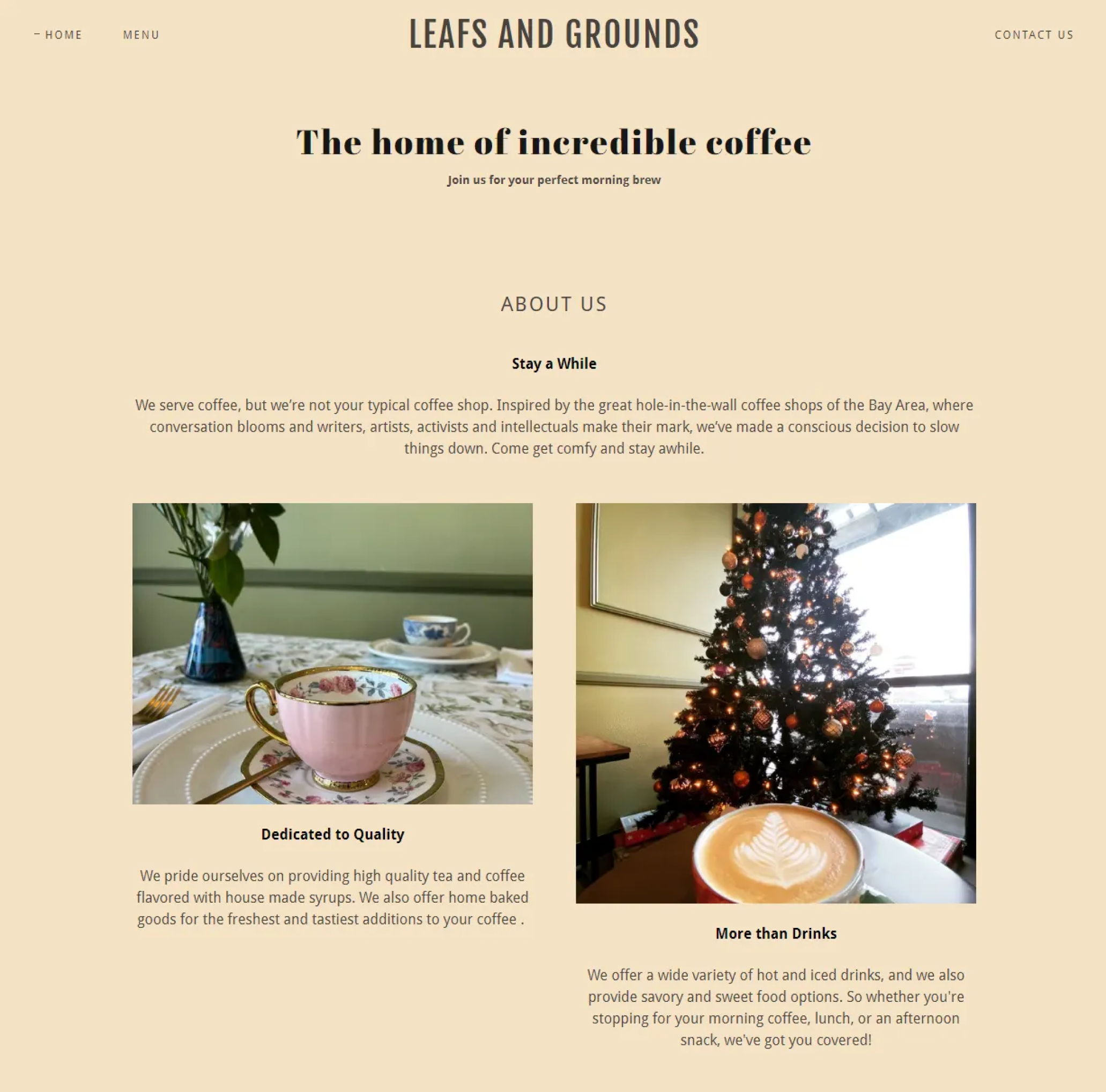
Changes
Fonts are more cohesive and have a sense of hierarchy.
Images that are the same size.
A color scheme that reflects the ambiance of the cafe: natural, eco-friendly, and local.
Separation in header, footer, and main content.
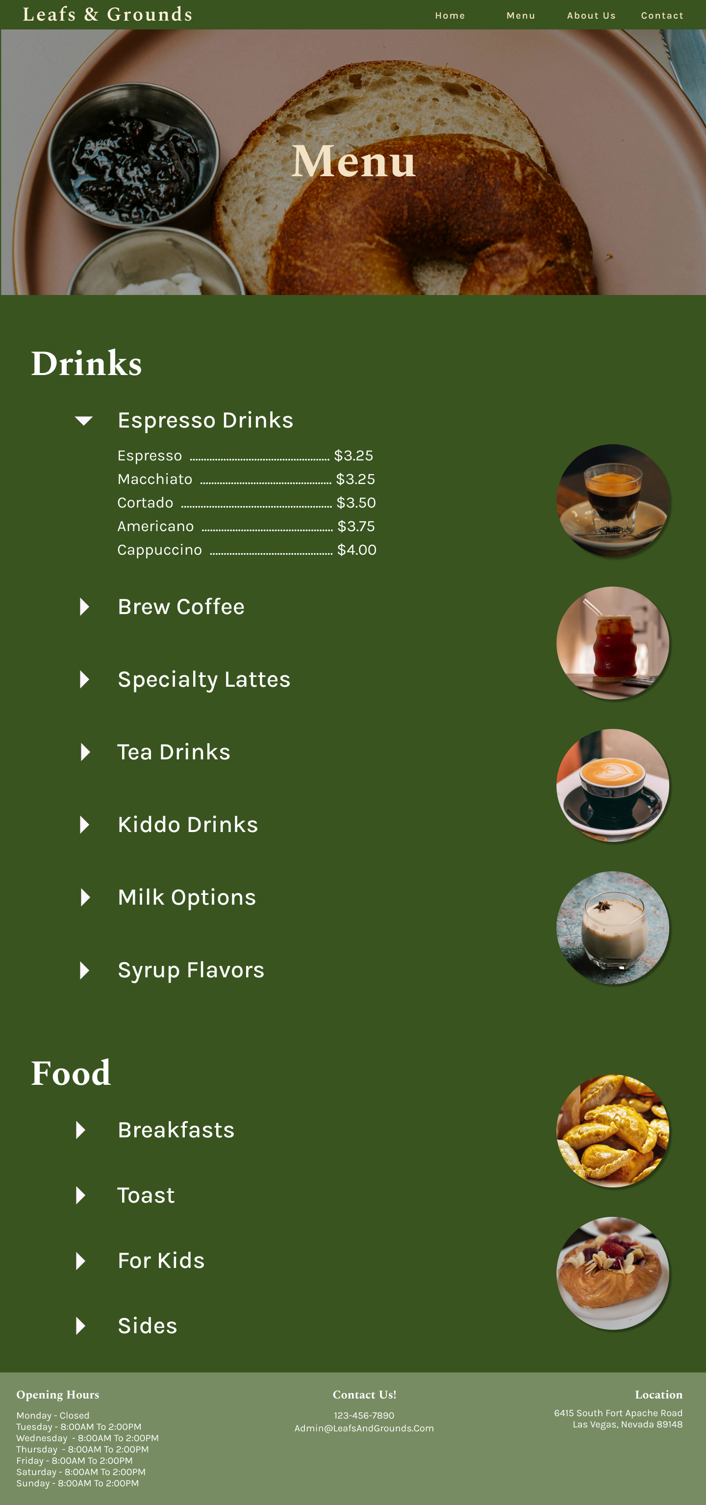
Menu Page

Changes
Drop down for easier menu navigation
Added images for visual appeal
Reflection
Since this is my first official site redesign, I wanted to incorporate the lessons I learned at the University. I believe this redesign is user-centric, as many of the changes were driven by user needs. However, I feel I could have included more images that better showcase the menu. The concept I developed from my initial sketches translated well into the final design, and I’m very satisfied with the layout. That said, I think my personal preferences for the color scheme might have had too much influence on the design. In hindsight, I would have involved the user more throughout the process to identify pain points and refine the design further. Overall, I’m pleased with the final result.