Expresso
This app primarily focuses on helping people find local coffee shops and how other people in the community experience them. This allows coffee enthusiasts to explore and discover new hot spots.
My role for this app was being the UI designer which made me responsible for the layout and visual design.
Project Overview
Goals
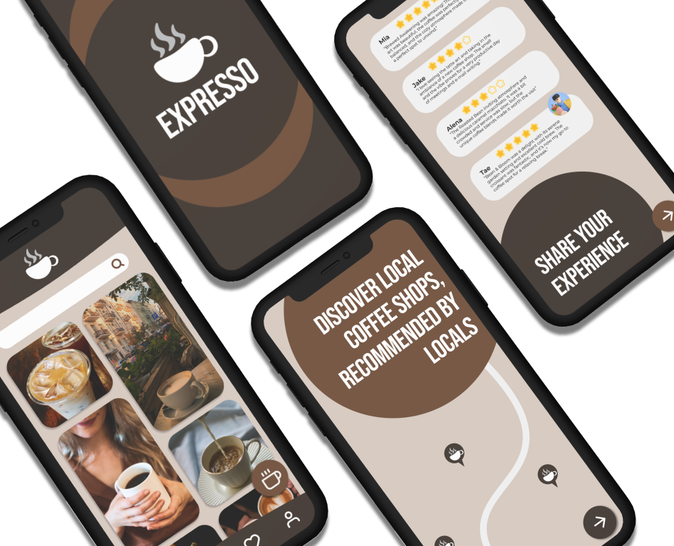
Include Welcome Screens to help users identify what the app is about
Have a home screen that is similar to Pinterest, so that users can share their experiences visually
Color scheme that captures coffee shop vibes
Design Process
I started by designing a coffee cup logo using InDesign
I did some research on different apps that included Welcome Screens to get a good foundation on what kind of information there should be
I then jumped into creating low-fidelity layouts in Figma to meet the goals that I had for the UI

Moodboard


From Simple Design System by Figma
Final Design

Reflections
Challenges…
Finding more than one color to work with. I knew I wanted to do a brown color but didn’t know what else to incorporate. I considered using an off-color like green, but it wasn’t meshing well with my main color, so I opted for a monochromatic color scheme with the help of Adobe Colors.
I wasn’t sure what I wanted my layout to look like and just designing wasn’t working for me, so I researched and started drawing before transferring to low fidelity. It would have saved me a lot more time if I did it sooner.
What Went Well…
Using the icon library on Figma reduced the amount of time for the design process because I wasn’t searching for too long for a minimalistic design
Adding a drop shadow to important buttons makes it stand out, specifically the coffee icon on the dashboard.
Lessons Learned…
This was a design project with very little feedback from users so in the future, I want to incorporate more user feedback to explore more advanced tools like prototyping.
Do not be afraid of wireframing! Sketching out ideas gave me more to work with. It helped me eliminate what wasn’t working and keep what was.